Travesía Cuatro
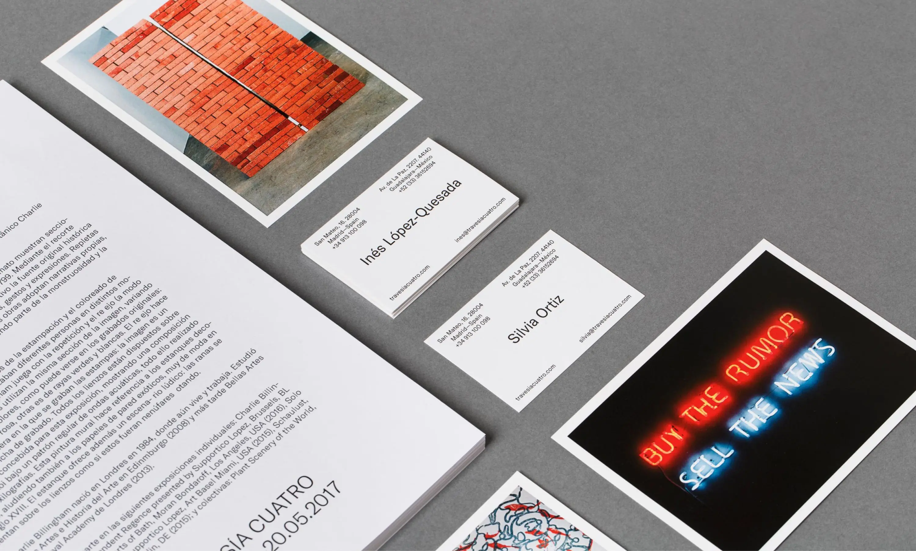
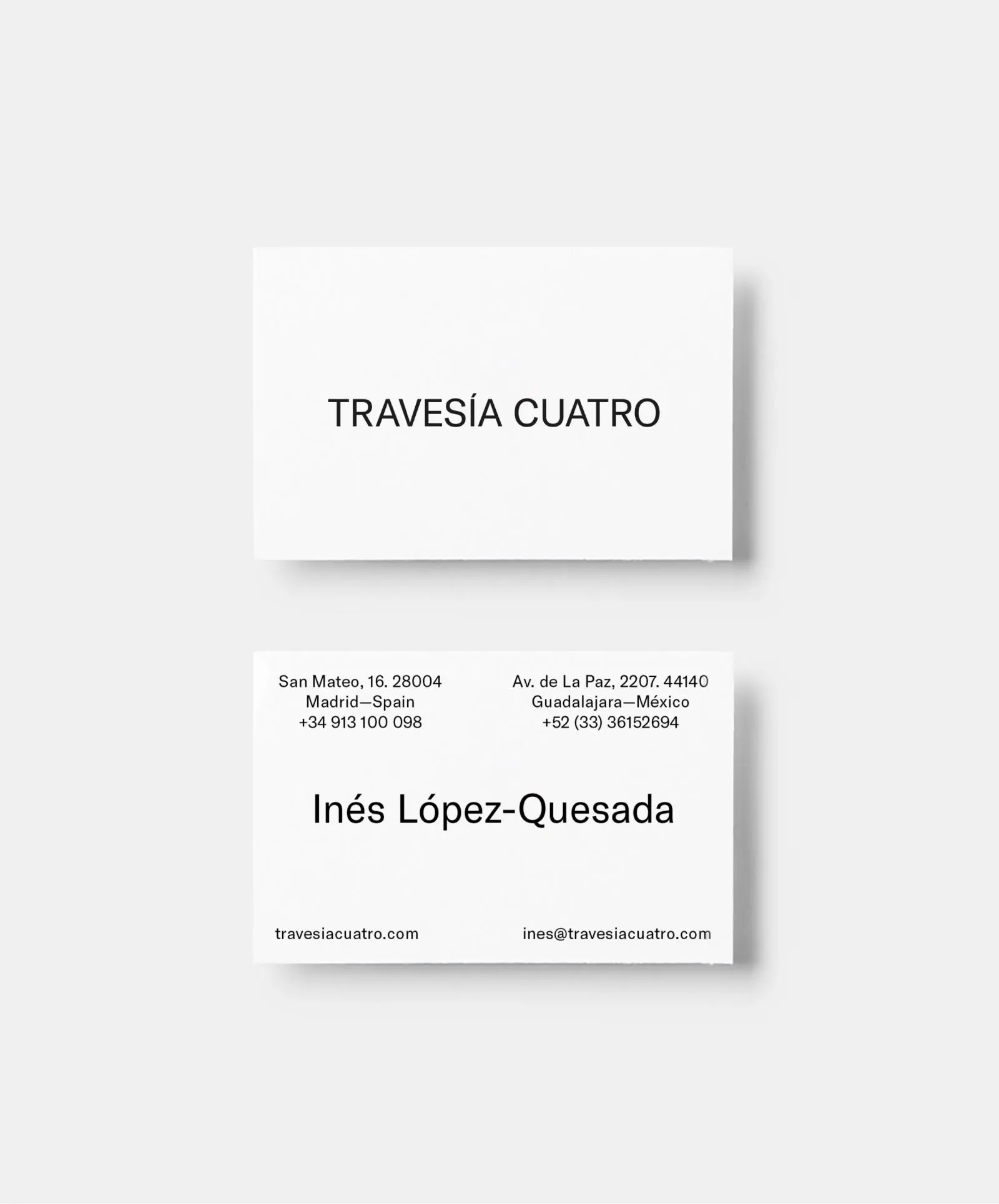
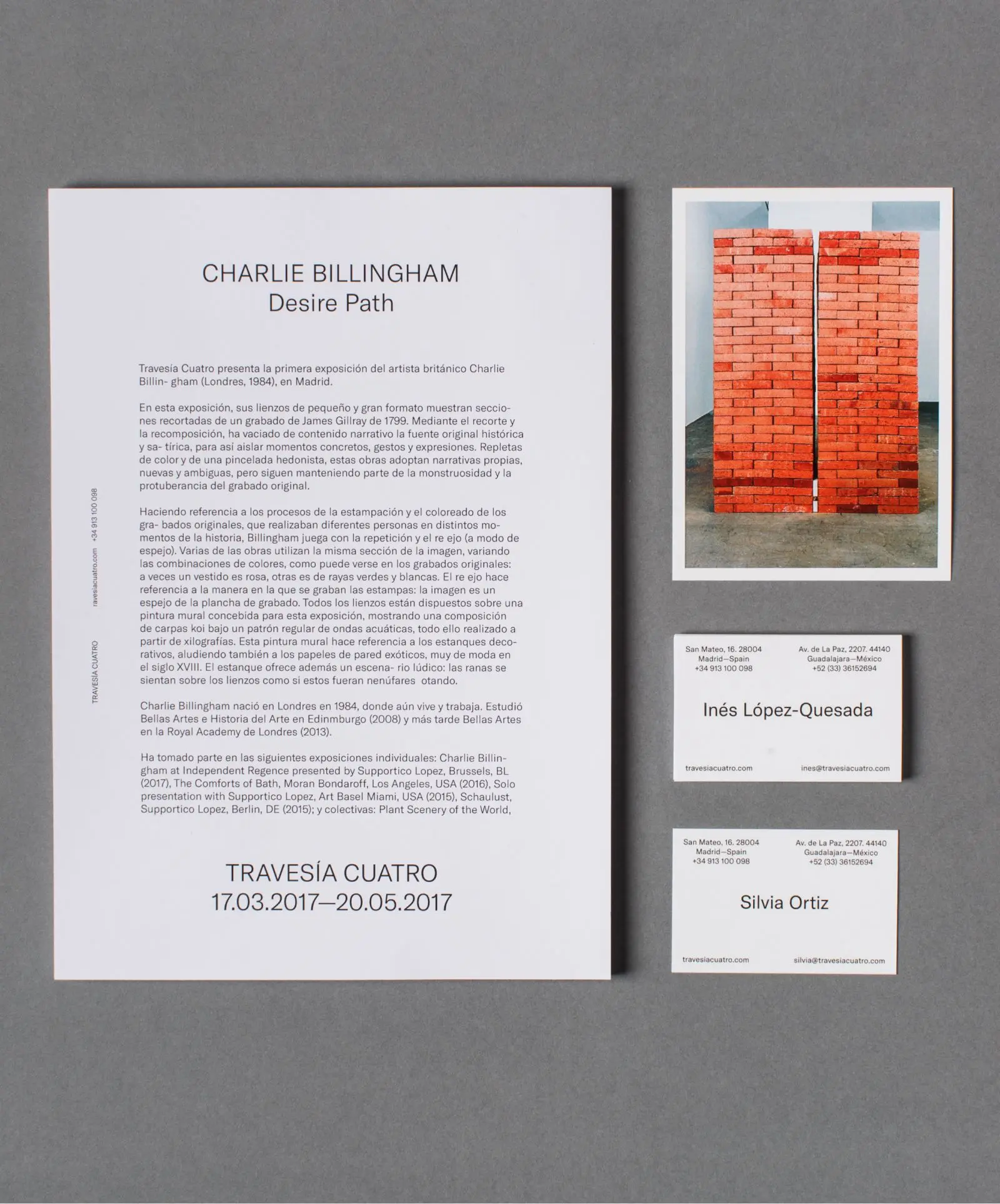
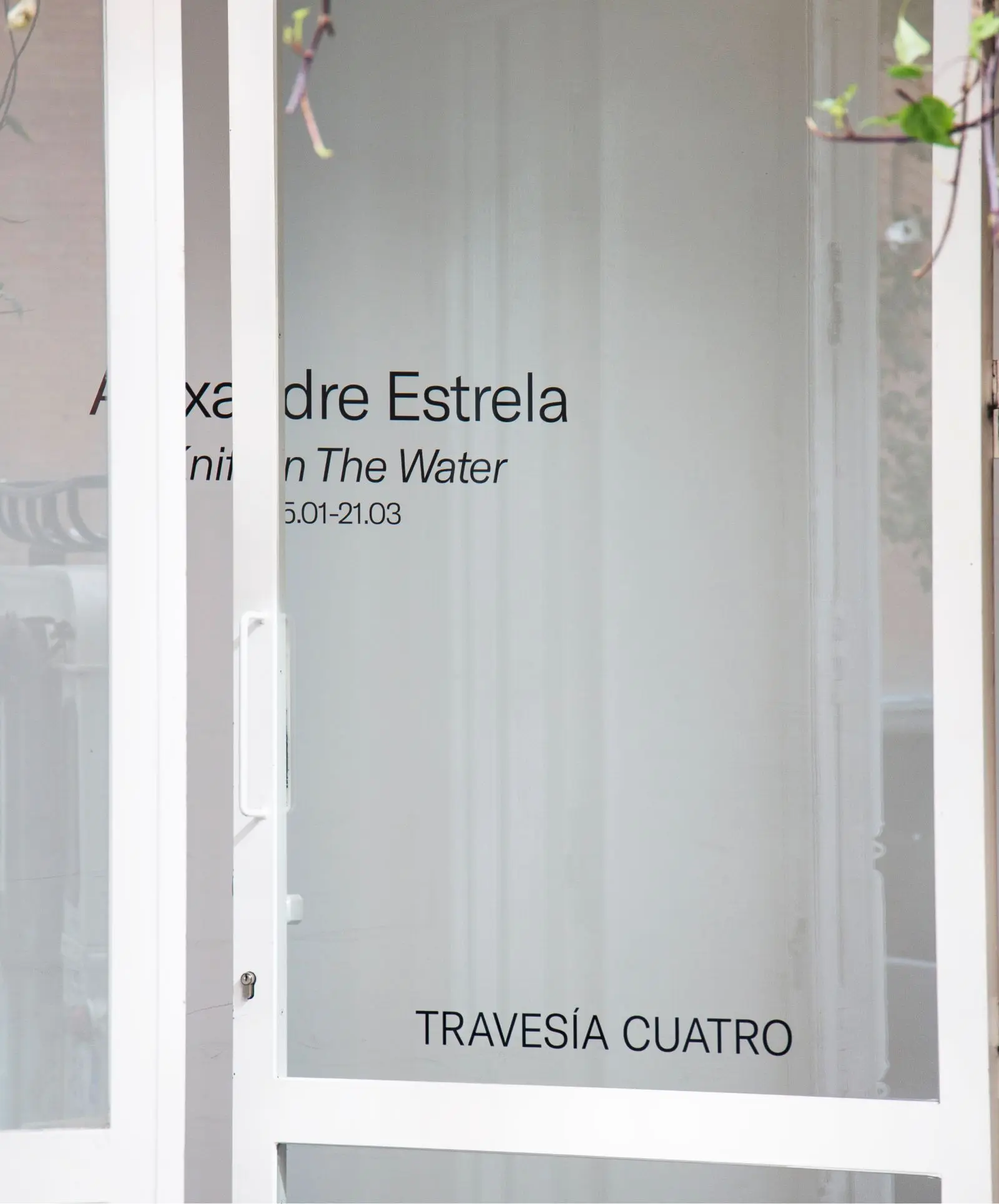
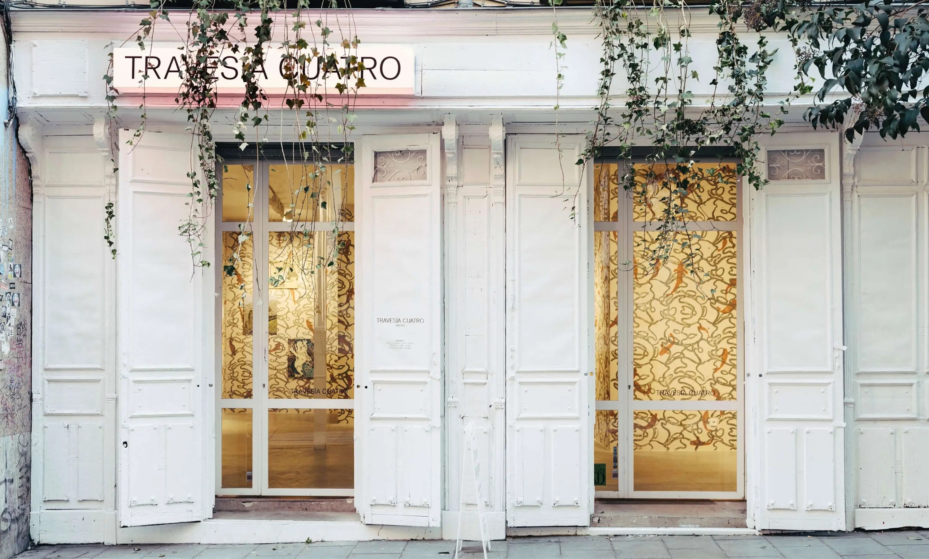
What’s an art gallery? An empty space that becomes one thing or another depending on what it contains at any given time. This concept structured the change we conceived for Travesía Cuatro, a contemporary art gallery founded in 2003 and focused on emerging artists. A new logo (black on white: simpler) evokes the same feeling we poured into the web: tabula rasa, clean slate in which things can happen. We composed the site (colorless, pristine) thinking of a skeleton’s structure: boxes overlap and move with you, the visitor; boxes designed to show you what you want to see. And what does someone who visits an art gallery’s web want to see? Images first, information later. Visual impact and usability: that’s what we were looking for, offering easy access to both the Mexican and Spanish headquarters. A place to occupy and vacate, versatile and dynamic; screen with which to maintain a dialogue.
